Last week at GCDS, we rented a minivan and road-tripped around the island. One Banshee hacker (Bertrand), one F-Spot hacker (me) and six guys from the GNOME art team (Garrett, jimmac, Benjamin, Andreasn, Vinicius and mpt). From a risk management point of view, this was suicide, who whould do our artwork if we drove into a ravine? Fortunately, that did’t happen, we had a great day and I can write this blogpost, a tale about design.
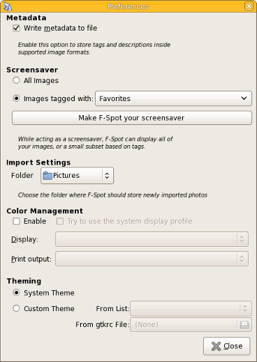
We were already aware of it, but hadn’t fixed it yet: the F-Spot preferences dialog is totally netbook unsuited. And it is extremely ugly. Behold:
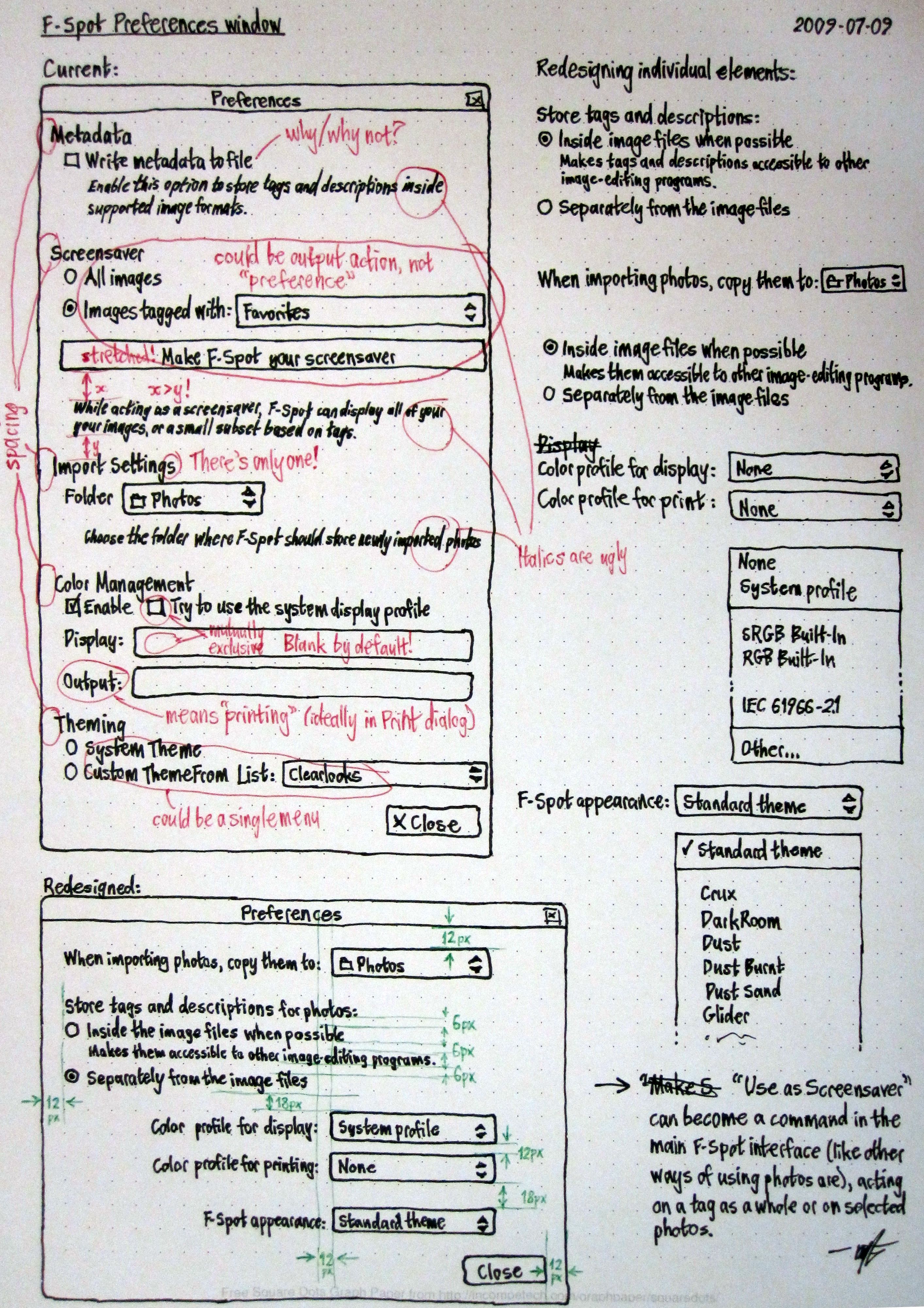
During GCDS, I was approached by Matthew Paul Thomas (mpt). He wanted to redesign our preferences dialog and fix it. We had a good chat and ran over the current preferences dialog, what it does and why. Two or three hours of sketching and drawing later, he presented this:
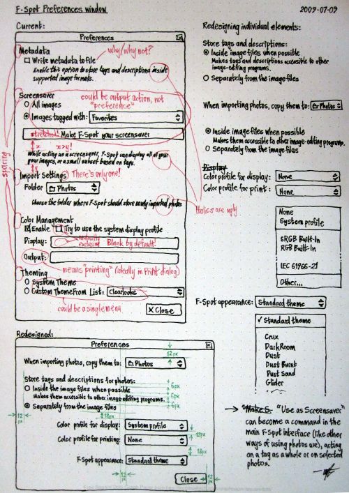
It’s a simple paper mockup, describing the current dialog, what’s wrong and how we can improve it. This was then followed by a proposal for a new design. For a hacker, this is gold. We generally aren’t the best user interfaces designers (let’s just admit it), but we do like good design. When given a spec, we can make things happen quickly. This mockup made sense and it was sound: it follows the HIG.
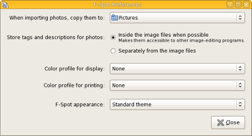
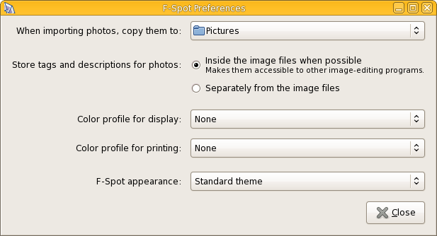
I handed it over to Stephane Delcroix and an hour of hacking later, we had a new preferences dialog:
Much nicer!
The moral of the story
The moral of this story is twofold:
- For hackers it’s important to realize that our artwork team isn’t just a bunch of guys with an obsession for pretty icons. They also do our visual styling and help us design great interfaces (one of the things that made GNOME to be a success). If your interface sucks, turn to them.
- For designers: we love you and even if you don’t feel like coding, a simpel well thought-out mockup can have a huge effect. If you feel stuff is suboptimal, go to the maintainers and talk to them, usually it’s not a big change, but with a large result. And generally maintainers love UI suggestions, if they make sense. And as a shameless plug: we at F-Spot really love UI designers, we know it isn’t what it should be and if anyone wants to help with these kind of things, do get in touch.
It’s this kind of cooperation that makes the GNOME community such a nice place to be in.


That looks awesome!
I wish that more FLOSS developers expressed their love for interface designers as you do.
On another note: what’s happening in the f-spot community with abock’s proposal for merging f-spot and banshee?
@zekopeko: It’s important to note that there are no plans to merge the two applications. We might be sharing the same base platform in the future, but both applications will continue to exist. What Aaron is planning is to add very basic photo support to banshee. We at F-Spot want to support so much more than that. Therefore we need both. But perhaps we’ll share some of our internals.
Looks great! This was a small bit that discouraged me from switching to F-Spot. Maybe I’ll give it a try next release.
I have one suggestion; I think there need to be a bit more space on the top. The mock-up specifies a 12px space from drop-down list rather than from the text. Even so, It looks great.
I have a suggestion too: the “store tags and description for photos…” part could be better (I think) reversed. Let me explain: the choice the user has got to do is about sharing the tags and descriptions among all image-editing programs. Storing them in the file is just a side effect.
So I would propose a single checkbox with the text:
“Share tags and descriptions with other image-editing programs (stores information in the image)”
Nice change! Although the mockups looks much better (IMO) than the final result. This is due to the radio buttons following “Store tags and descriptions for photos” being to the right instead of below it. This is making the window way to wide. Look at the mockup!
I’d kill a theme as no other program is using it – why I’d like to have one program not consistent with others?
Also – why would I *not* like to share tags and descriptions with other programs?
That looks like a huge improvement to usability. I have a couple of additional suggestions which would help F-Spot integrate better with the rest of the system:
- The “use as screensaver” preferences should not live in F-Spot at all; they should live in the user’s screensaver preferences, just like configuration for any other screensaver. F-Spot just needs to have an option somewhere for “Use F-Spot as my screensaver”, which would open the user’s screensaver preferences.
- Why does F-Spot offer an option for using a theme different from the rest of the system? Even if such an option seems sensible, it seems like that option should live in the user’s GNOME appearance properties, as some kind of “Application-specific themes” section. F-Spot could then just link to that.
- The XDG user-dirs stuff already offers a way to configure user directories for many things, including pictures via XDG_PICTURES_DIR. F-Spot should certainly offer to configure the location for pictures, but it should ideally use the XDG pictures directory, and configuring the location in F-Spot should set XDG_PICTURES_DIR. You *might* want to offer the option to configure F-Spot’s pictures directory independently of XDG_PICTURES_DIR, but I can’t think of any good reason why.
@Josh: That’s indeed where the screensaver options should live, but gnome-screensaver does not allow this yet. So for now we have to keep it in f-spot, unless we want regressions (which we don’t).
Why do we offer the option to change the theme just for F-Spot? You are all very right that it breaks consistency and is generally very ugly. I do too. But photographers might not agree, it so happens to be that color photos are best viewed on a neutral grey background, to avoid eye adaptation to white or black (whichever your theme is). Therefore photographers want a very boring greyish neutral theme (check e.g. the theme jimmac uses). As this neutral grey isn’t very fun to watch for day to day work, we offer the option to apply it just for F-Spot. In short: we might not care, but some of our power users certainly do.
As the driver for this road-trip, I had a rather big responsibility : one wrong turn on the sinuous roads of Gran Canaria, and the next GNOME releases would probably be ugly…
Not to mention the absence of such nice blog posts !
Fortunately, all went well and we enjoyed the island.
I think that I agree with liberforce that the radio buttons could simply be merged into a single checkbox.
If there’s really a reason to keep them as radio buttons, then I agree with anonymous above that the sketch looks more visually appealing than the final result with the radio buttons on the right. They seem to flow nicer in the sketch where they are below the “prompt” (not sure what the correct terminology would be).
That said, this new dialog is a whole lot better than the old one!
That’s some nice penmanship there.
Great to see the new preferences dialog implemented, and I’m very grateful we survived the trip.
According to the book “Designing Interfaces” [1], checkboxes are good when you’re short on space, but the downside is that it’s reverse remains unstated. Please trust mpt here, he knows what he’s doing. :)
1. http://www.amazon.com/Designing-Interfaces-Patterns-Effective-Interaction/dp/0596008031/ref=sr_1_1?ie=UTF8&s=books&qid=1247934093&sr=8-1
That mockup, was it made using pen-and paper? Else which software?
MPT is a genius. ‘Nuff said.
Well done
Great!
Now, let’s do the same for the import dialog, fix the time insanity and you will have a rocking 0.6 release ;)
Good story. Good work.
@Ruben (& MPT): Flawless victory!
@Pascal, missed you @ GCDS!
@Lefty: yea
“If your interface sucks, turn to them.”
If your interface sucks, it’s usually already too late. You should have asked them for help first, not afterwards when all they can do is rearrange things a bit.
A great contum – fix to make more usable and simple gui. Contratulations!
i was looking at f-spot themes, but really interesting to find out how you guys end up with the new preferences layout. yep it does look better and more friendly. keep up the awesome job :)
Just goes to show how important good design is. Excellent blog!
Now that you are thinking ‘Netbook’ and limited screen space, what are your thoughts on ‘animating’ flow to show the user what’s happening? :-) …. Clutter springs to mind!
Please keep up the good work, we used your tool for the splash screen on the Linux Vodafone Mobile Connect card! ;-)
I’m not real keen on the long descriptions of the controls’ labels; in my opinion such details are better provided as tooltip blurbs.
“When importing photos, copy them to:” — Is F-spot used to import things other than photos? Also, the wording suggests that the copying is not inherently part of the importation process (this may be the case, but then shouldn’t an option be provided to “not make a copy”?).
“Store tags and descriptions for photos:” — Again, is F-spot used to handle meta-data for “non-photos”? Also, the options available seem limited to *where* the meta-data is stored, while the group heading suggests a slightly broader scope (i.e., *whether* the data is stored). The radio grouping also implies that if the meta-data is stored in the image file, it will not be stored in the F-spot database — if this is not so then a single checkbox toggle (“Embed tags and descriptions in image file”) would be more descriptive.
“Color profile for display”
“Color profile for printing” — Fairly concise, but it’s pretty obvious that the profiles associated with displays and printers are “color” profiles; and if the user does not make the connection then a tooltip blurb can provide the needed enlightenment.
“F-spot appearance” — It would seem intuitively obvious that within an F-spot Preferences dialog, any setting would be relevant to F-spot.
So using your team’s new preferences dialog as a starting point and eliminating some of the tautology, I made my own mockup which addresses the above comments:
http://flashingtwelve.brickfilms.com/Temp/f-spot-prefs-new.png